 Interior designers, much like professionals from other industries, really value repeat customers.
There are so many reasons for this, but for me, it’s all about relationships.
It’s not just that the clients liked my work so much that they want to hire me again. (That’s definitely the ultimate compliment!) One of the biggest rewards of repeat clients is that I get to know the families I work with.
I feel so overjoyed when I am called back to redesign another room in a client’s house because that means I have found their ideal aesthetic and created a space in their home that is functional for their family.
I strive to find a style that speaks to the client and reflects their personality. When I’m re-hired, I know I’ve done just that and succeeded in making their house a home.
This was the case with clients I worked with about a year ago. The first time they called me, they were hoping to redesign their bedroom. We spruced it up with some bright fuchsia and magenta flowers paired with animal prints. It became such a glamorous room!
That project, highlighted in this blog from April 2020, was still fresh in my mind when the couple called me back for an even bigger project. They wanted me to redesign their main level dining room, foyer, living room, breakfast nook and kitchen.
This would involve a lot more design thought and time, but I was excited — because I knew I had some go-to inspiration in the bedroom I designed for them earlier.
Can you guess what element of that earlier project became the springboard for our new redesign? Well, if not, don’t worry, because I’m about to tell you.
Let’s take a look!
Repeating Patterns
My first task was to go back to that earlier redesign project and think about what made it work so well. I realized pretty quickly that we just had to find some more uses for the floral fabric we used for the shams and curtains.
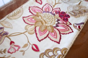 It was such a stunner for the room — elegant with a touch of glam — and I thought it would be so beautiful to carry the look throughout the home.
What makes this fabric so perfect for the home? Well, the floral pattern makes it formal enough to belong in a dining room, the cream background makes it traditional enough to go with the existing furniture, and the magenta, burgundy and purple tones give it a little edge. In other words, it totally livens up a room.
You will notice this fabric in the dining room as a table runner and window coverings. The client had some really great oil paintings that she already owned, which pulled the same colors from the fabric. It seemed it was meant to be!
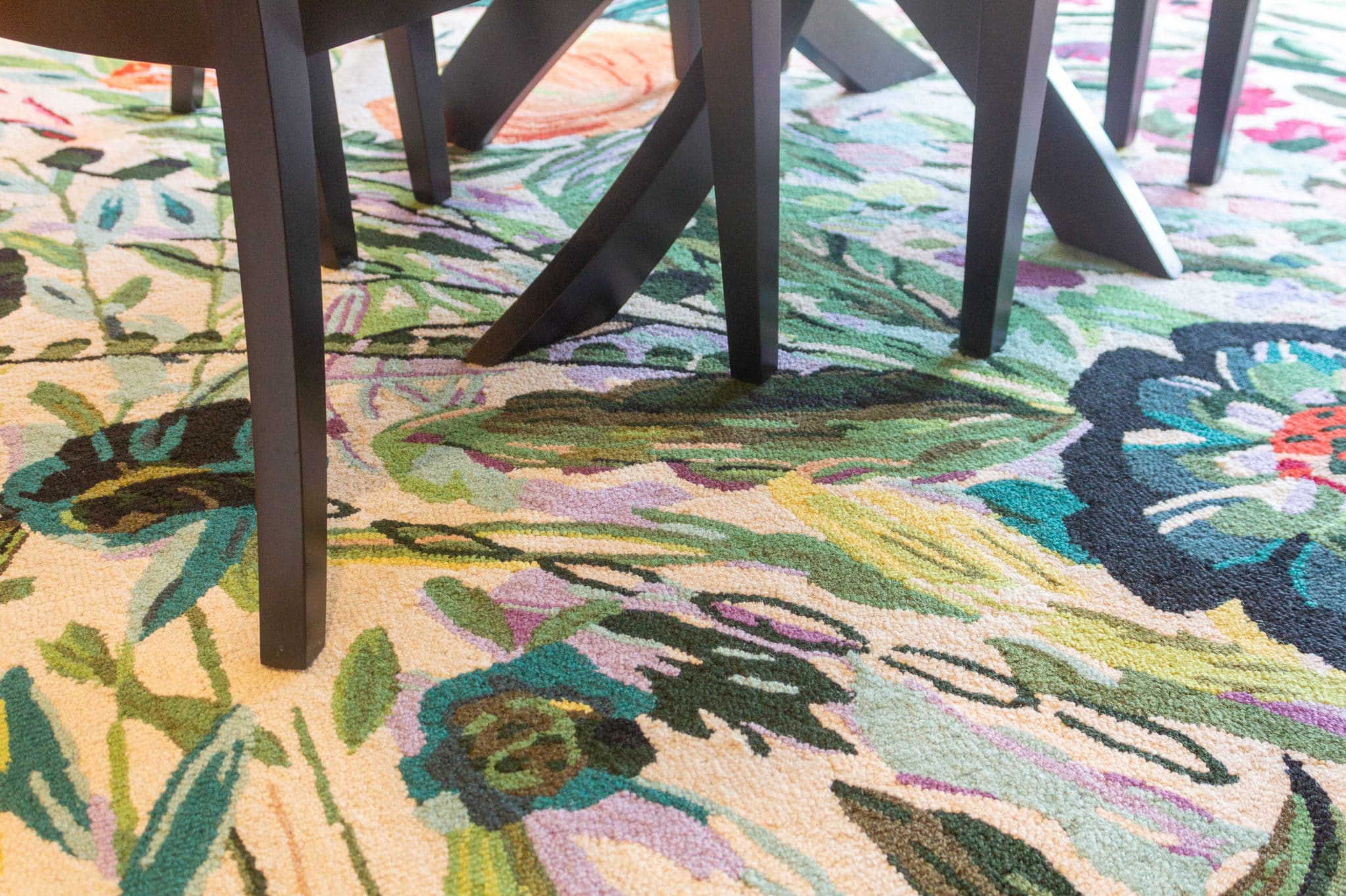
To keep with the traditional-glam look, we incorporated a simple yet elegant chandelier with a cream shade and a touch of crystals. Metallic gold accents can be seen throughout the room. The dining chairs were reupholstered to match the color scheme and we also brought in a new rug.
There are other places in the home where we also incorporated florals and I’ll talk about that more in a little bit. But I wanted to point out the dining room because it is a place where we carried that exact same fabric and in a completely different way — which was so fun to implement!
Speaking of other rooms in the house…let’s move on to the living room! This room also got a lot of redesign love, so I’m eager to share the results.
A Grand Piano for a Grand Redesign
 As you walk into the living room you can’t help but notice the beautiful piano. The client’s husband and children all play, so this gorgeous instrument does get used quite often — it’s not just design eye candy!
Because the piano contributes a more traditional feel, I thought we needed some bright colors to add playfulness to the room.
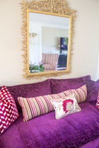
I was so fortunate to get my client on board with the rich jewel tones you see throughout this area. I don’t think all of my projects could pull off a purple sofa but this house does it magnificently! And if you recall, that floral fabric that inspired so much of this project also carried those same tones.
I can just picture the family sitting here and enjoying piano music. So beautiful.
The living room, by the way, is very long and allows for multiple seating areas. So it made sense to have a more formal living room in the front, near the piano, with a more casual family room closer to the kitchen, in the heart of the home.
The sofa is complimented perfectly by two striped swivel chairs. And an ornate mirror and mantle accents from Metro Lighting tie all the elements together.
In order to help break up the different areas of the room, I decided we needed to beef up the fireplace. The oil painting on the mantle was purchased on a trip and is special to the couple. It is gorgeous and I felt that a larger surround would break up the room while showcasing artwork.
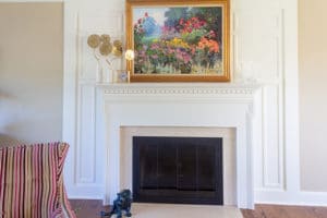 So we had Phase 2 Contracting out of Millstadt, Ill., come in to add extra molding around the fireplace. I’m so happy with the end result. It definitely had the desired effect! Before, the fireplace got lost in the room, but now it makes a grand statement while still looking so natural.
A More Casual Touch
Moving further into the living room, we get to our more casual section which includes a small breakfast area. Here, you see a new sectional, ottoman and end tables in the home’s color palette of cream and gold. And once again, we carry those jewel tones into the room — but just a touch this time — with the throw pillows and ottoman.
This lovely TV stand from Worlds Away adds a slice of glamour to the room. I love the sleek black stand with the neutral paint color and sofa.
And this desk, from Lexington Furniture, is hand painted and so beautiful. Just look at those darling dragonflies! I love incorporating a piece of furniture that is meant to be practical but turns out to be an eye catching piece. This desk is just that!
Custom made cornice boards from Eye On Design were made to flow with the crown molding in the room. This is not only stunning but functional as well. The headrail of an automatic shade is hiding behind the cornice board. It is out of sight, but with a remote control to lower the shades for optimal television viewing.
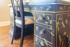 The walls were painted with Malabar by Sherwin-Williams. This is a great neutral which freshens up the room and coordinates so beautifully with the window treatments.
Finally, to keep with the floral theme but with a more casual feel, we found this round rug on grandinroad.com. I just love the bright colors and how it pairs with the desk!
Of course, there was a time we didn’t think we’d ever get this rug. Thanks to shipping delays and distribution issues, this rug took 10 months to find its way to this breakfast room! (Thank you again to all of my clients for being so patient through these types of frustrations!)
The new table and chair set from Dinec fits perfectly with the rug so we were relieved to get it all in place. These days, you just never know what will end up being your biggest challenge on a project!
All the floral arrangements, by the way, were made by Grimm and Gorly Florist in downtown Belleville. They make lovely fresh and silk arrangements and are so wonderful to work with.
Extra Touches Here and There
Since we were giving pretty much the whole main level a redesign, there were a lot of other changes we made here and there to bring the space to life.
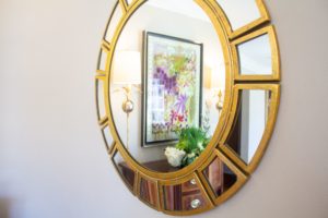 In the foyer, we gave the staircase a facelift by painting the balusters and risers black and adding a dark charcoal runner. This is such an effective way to update a staircase that may be looking dated with stained wood. And so easy!
To tie in the black wood, we found this gorgeous display case from Hooker Furniture. I love adding subtle lighting to areas that tend to be dim, and this lighted cabinet just glows so beautifully at night with the curved wood in the doors.
More floral artwork adorns the foyer and hallway. Remember, we never wanted to stray too far from that earlier inspiration!
There are a couple of pieces of artwork that I must point out. One is in the foyer and the other over the buffet in the dining room. These pieces are custom made by local artist, Sharon Aach. Sharon’s art is reverse painted behind glass so what you see on the glass is actually the first strokes she makes and she builds on it from there. Mind blowing yet gorgeous!
Sharon incorporated the color palette we used in the home and created some unique and stunning works of art! Check out her website https://saachart.com/ or give her a follow on instagram @sharon_aach.
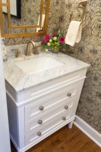
And of course, we can’t forget one of my favorite spaces — the powder room! If you’ve been following me for a while you know that I love wallpaper in a powder room. And just how amazing is this floral textured wallpaper? And the stunning light fixture from Metro Lighting is just icing on the cake. This room demands attention!
 Finally, with all these changes being made, we couldn’t completely ignore the kitchen. We added a backsplash and darker countertops to give the room a fresh feel, but without major renovations. It’s once again a reminder that there are always ways to make small changes that have a big impact!
Redesign All Over Again
I have truly loved working on this home and getting to know the homeowners. I am practically a member of the family I’ve been over there so much! But that’s what I adore about this job and I wouldn’t have it any other way.
If there’s an area in your house that can use a redesign or remodel, please reach out to me. I’d love to help you find your style — whether for the first time, or on a repeat visit!
