 As an interior designer, one of the greatest compliments you can receive is being hired back time after time to share your talents with the same clients.
Those of you who follow this blog regularly should by now be familiar with this home. Bit by bit, over the years and one room at a time, I’ve helped transform the room of this stunning home.
With my clients – the Koller family – we’ve redesigned the great room, dining room, hearth room, girls’ bedrooms and kitchen.
And now, we’ve added one more room to our repertoire.
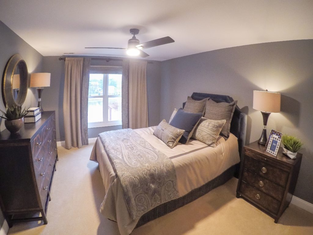
My latest project involved updating their son’s bedroom. Unlike the Kollers’ other rooms, which yearned for more feminine and elegant looks, this room was begging for a classy, masculine touch.
So design-wise, it was a nice change of pace and a great opportunity to round out the home.
As you can see, we went with a strong and calming color scheme — dark blues and greys, and a touch of taupe mixed in. This is a masculine palette that suits a wide age range, and an array of tastes. With a palette that is so universally-appealing, this look will last the room for quite awhile, even as the family’s needs change.
(This is a great tip to keep in mind if you have kids and will ultimately find yourselves as empty-nesters.)
 As the room came together, I created visual interest by incorporating a variety of patterns into the design, mainly with the bedding, curtains and throw pillows.
The primary fabric, from Eastern Accents, is in a subtle paisley pattern. I used it generously throughout the room to create repetition.
In addition to the bedding, drapes and pillows, you’ll also see it in the shower curtain that was custom created by Eye on Design of Belleville.
And notice that even though this room leans masculine, it still has a very lux feel. It’s proof that with the right choices, it’s possible to accomplish both!
The padded headboard from Bernhardt helps contribute to that plush atmosphere.
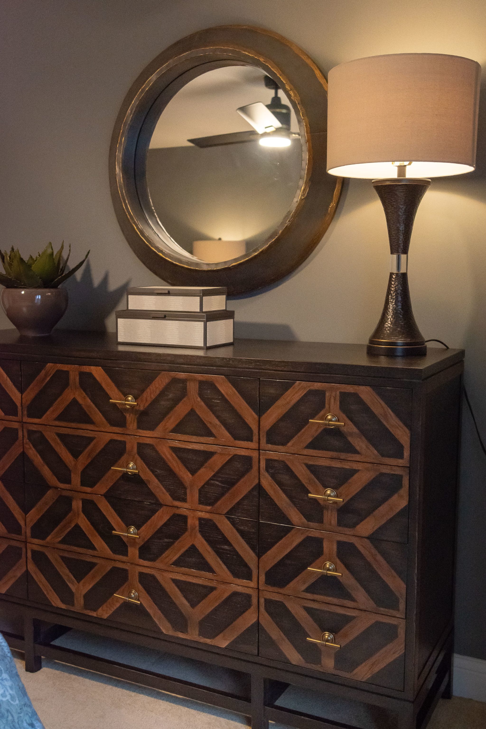
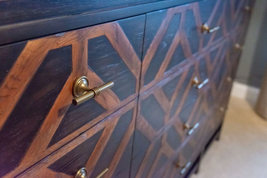
One of my favorite elements in this room is the dresser, which is from the Humphrey Bogart Collection of Fine Furniture Design.
It adds just a touch of Hollywood glam, but in an understated way that doesn’t feel out of place in a young man’s room. The nightstand that I chose is also from this collection.
The lamp, from Home Goods, completes the look. As you’ve heard me say before on this blog, classy doesn’t have to mean costly! Lastly, the mirror and ceiling fan are from Metro Lighting of St. Louis.
Thanks again for joining me on this design journey. I just love being able to share my projects with you! And remember — I’m always available and eager to help you find the right look to update your home. Contact me today!

