 Last week, I introduced you to the Koller home, which I have been working on piecemeal over the course of a decade. If you remember, we first reconnected with this family in 2014, when they were seeking to update the bedrooms of the two daughters who had gone off to college.
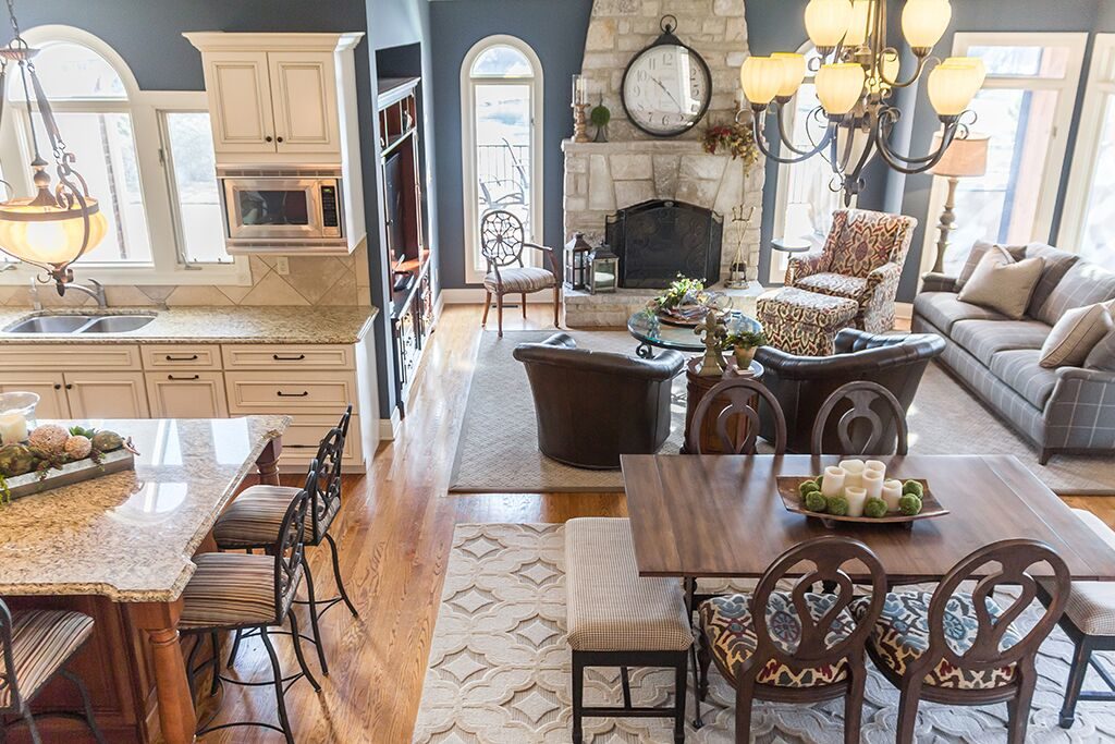
I was called back in early 2017 when the couple was looking to update their hearth room and kitchen. This was to be more of a refresher than an overhaul, and we were working on a fairly tight deadline to have the rooms ready by spring.
We discussed bringing in new furniture, floor coverings and accessories. The plan was to keep the existing “bing cherry” wall color, so my challenge would be to design around that.
Of course, in the design world you always have to be prepared for plans to change. I’ll talk more about that in a bit!
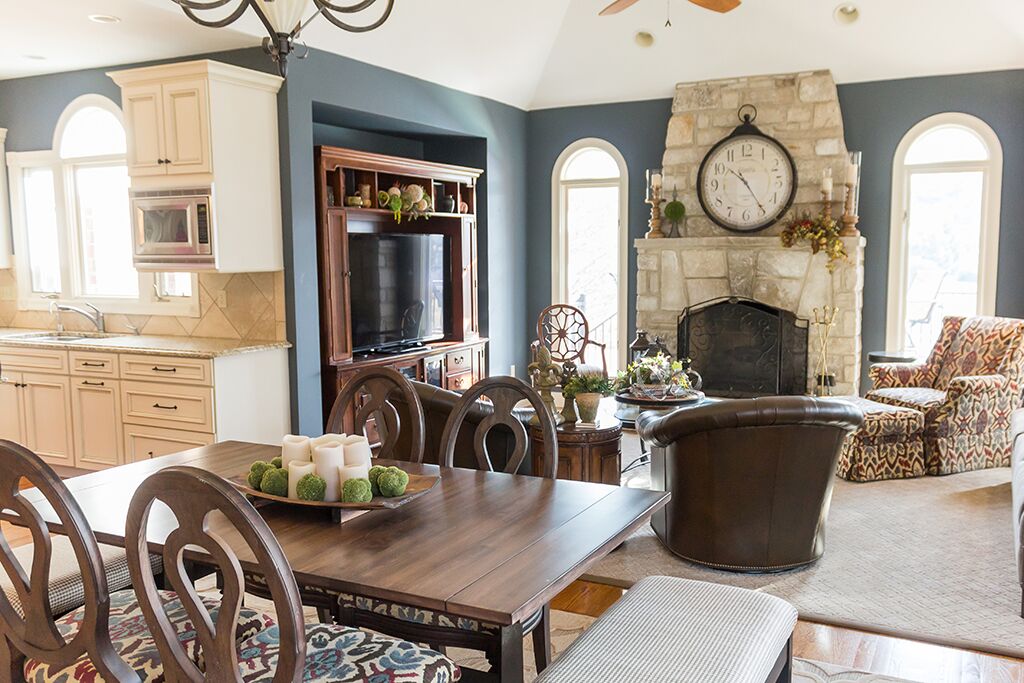
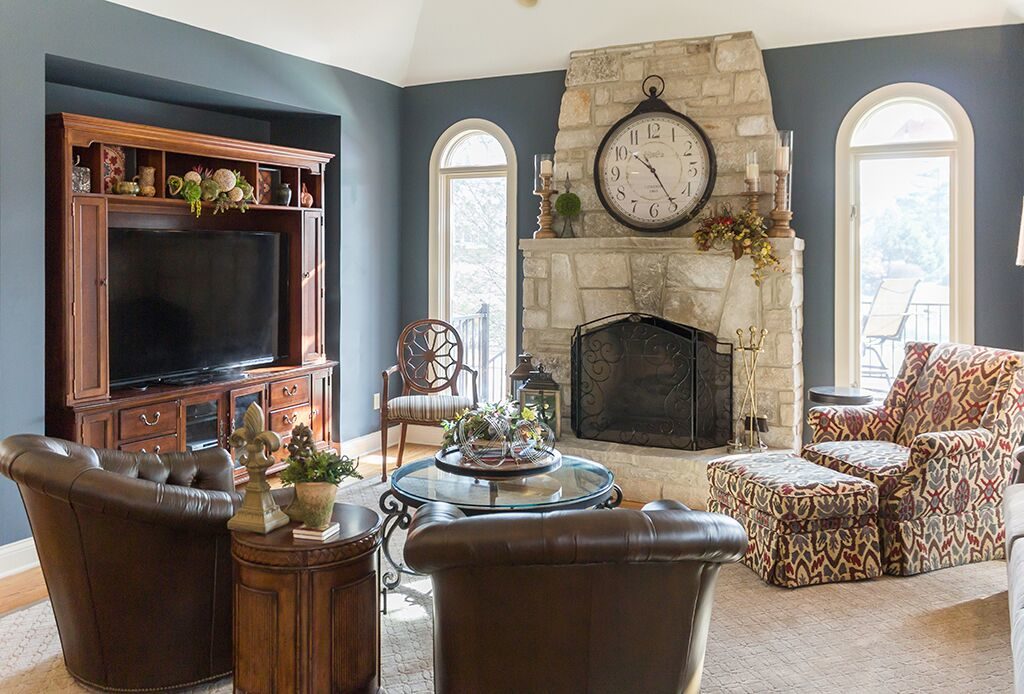
Mrs. Koller was really interested in having a sort of ski lodge look and feel for these rooms. But at the same time, I wanted to keep things warm and inviting because this is a section of the home that the family uses a lot.
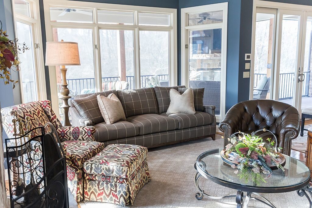 I started with the fabric and rugs – a wise decision, because once we found the main fabric from Stroheim and Romann, it set the tone for the whole room.
We used this fabric for the armchair and ottoman in the corner of the room. Then we started pulling in similar colors elsewhere in the space.
The brown tones are repeated in the leather swivel chairs from Lexington Home Brands and the wood furniture. A grey/blue hue makes an appearance with the sofa.
The cream color is found throughout the room: with the stone fireplace, the throw pillows on the sofa (from Bernhardt), the piano benches at the kitchen table, the broadloom carpet (with a border we added to it) and the kitchen countertop.
The cream helps balance out the darker tones, keeping things light and airy.
We kept a cocktail table that was original to the room, and replaced an upholstered ottoman that didn’t quite work in the renovated space.
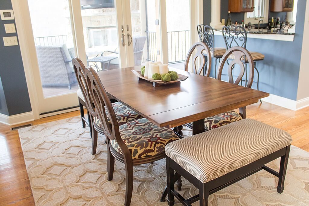 Mrs. Koller also wanted to keep her kitchen table, which could seat up to 10 people with the extra leaves added to it. But we wanted to update the look, so I called in Quality Furniture Restoration of St. Louis for more of their outstanding refinishing work.
As you can see from these pictures, they really did a fantastic job, using a charcoal stain that ties the kitchen and hearth rooms together.
Then we added some new chairs, using a fabric that complements the hearth room armchair, along with the piano benches that we mentioned previously. These benches are a nice touch because they allow for more people to sit at the table if needed, without it feeling too cluttered.
Now, remember how we talked earlier about being able to adapt if plans change? And recall that bing cherry wall color that we originally decided to work around?
Well, as we got into this redesign Mrs. Koller started rethinking the bing cherry. The rest of the house was being repainted, so she thought it might make sense to change the hearth and kitchen areas after all.
 When she approached me with this change of heart, I was excited to oblige.
I found a blue/gray from Sherwin Williams that worked well with what we had already designed for the space. It was a big change from the red, so Sandy was a bit nervous about it at first, but she has grown to love it.
I personally think this color took the design to a new level, proving once again that the right paint color can really make or break a room.
Stay tuned for my final blog in this series, where I tell you about a room that turned into the crown jewel of the Koller redesign project!