Via https://www.pinterest.com/explore/color-of-the-year/
For those of us of a certain age, Pantone’s Color of the Year for 2017 is a throwback to the palette of our childhood homes.
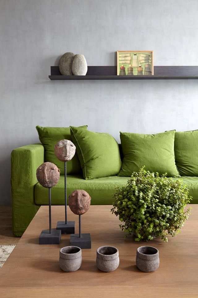
Greenery 15-0343, a yellow-green shade chosen by the folks at Pantone as THE color of 2017, looks an awful lot like the avocado green our parents once paired with harvest gold, dark brown and orange.
If you grew up in a house designed in the 1970s, you probably had furniture, wallpaper and housewares in that color scheme. If your parents were really on trend, you might have even had an avocado green or harvest gold refrigerator, bathtub or kitchen sink.
While retro and vintage are certainly “in,” it may seem a little regressive to choose a color that seems so reflective of the past.
But actually, that’s what makes it perfect for 2017.
The earth tones of the 1970s were the result of the American public’s desire for peace and calm in the aftermath of the Vietnam War.
After the tumultuous year that was 2016, people are again seeking a reconnection with nature and a sense of inner peace.
From that perspective, Greenery makes perfect sense.

Via https://www.pinterest.com/explore/color-of-the-year/
Shades of green are calming because they remind us of nature, the environment and the outdoors – something our hectic, technology-driven society craves more and more.
“We know what kind of world we are living in: one that is very stressful and very tense,” said Leatrice Eiseman, the executive director of the Pantone Color Institute. “This is the color of hopefulness, and of our connection to nature. It speaks to what we call the ‘re’ words: regenerate, refresh, revitalize, renew. Every spring we enter a new cycle and new shoots come from the ground. It is something life affirming to look forward to.” (excerpted from the New York Times)
I’m excited about this year’s Color of the Year because it helps evoke a sense of peace without being as bland as the beiges and grays that have blanketed the landscape for the last several years.
Even better, Greenery is versatile. It can be paired with almost any other color – yellows, browns, pinks, blues and purples – to create a specific mood.
According to Pantone, it takes their team of experts roughly nine months to select the Color of the Year. The team starts by scouring the globe, examining the palettes being used in a variety of industries, from car shows and fabric lines to fashion runways.
 Inevitably, some colors begin to shine through as the frontrunners across all industries. One shade is ultimately chosen as the winner.
Last year’s color of the year was actually two colors – serenity and rose quartz. It was the first time Pantone had ever chosen two colors (which by the way were basically a light blue and a light pink.)
According to the New York Times, Pantone started choosing Colors of the Year in 2000, “in part as a way to demonstrate the psychology around what makes a color take off and to answer the question every fashion person is routinely asked, ‘Why is the color ____ so popular this season?’”
When they choose the color of the year, Pantone is clearly making much more than a statement on trends in fashion and interior design. They’re taking a stand on the state of the world, and how something as simple as a color can influence state of mind.
What do you think of Greenery? Could you see yourself decorating with the color in your home? As always, contact me with any of your interior design questions or needs.