 A great room design can’t happen without great inspiration.
Whatever speaks to you or the client is the starting point — maybe it’s a favorite vacation place, or a celebrated color, or a certain time of year. That is your inspiration.
You’ll find that once this vision is clear and at the forefront of your mind, everything else falls into place — almost on its own. It’s simply a matter of articulating and executing that vision.
Exactly what do I mean by this?
Well, let me take you back to a longtime client of mine who has always had a very clear idea of her tastes and the direction she wants me to take a room.
Remember the Joyce family? I’ve worked on their living room, hearth room, breakfast room, lower level and kids’ rooms.
And what a fun time we’ve had!
I mention it today, because Katy Joyce is a big fan of the preppy look encapsulated by the Kate Spade, Tory Burch and Lilly Pulitzer clothing lines. This became our inspiration, and the core of my design work for a number of the rooms mentioned above.
Bright splashes of color mixed with a couple of distinct patterns, and we were off to the races. If I do say so myself, these rooms turned out lovely, and could easily fit into any one of those designers’ catalogues.
Take a look back — I promise it’s worth the time hop!
Recently, the family invited me back to work on their dining room. Katy was still loving the atmosphere we created in the rest of the house, so we decided to replicate the same look one more time in this formal gathering space.
Yay, for inspiration that withstands the test of time!
So, let me tell you a little bit more about how I unpack a design idea once we do have our inspiration, using the Joyce dining room as our example.
 Follow Your Inspiration
Whenever I am pursuing a certain look, I like to pull together idea boards that capture the theme. They don’t have to contain furniture or accessories or anything you’d ordinarily put in a home — although they certainly can.
The point is just to get into the design groove, so to speak, and to zero in on the theme.
In this case, that meant gathering pictures of the clothing lines in question and also of the feelings they elicit. Beach days on Nantucket, drinks on the patio, or even a stroll down Fifth Avenue in the summer — you get the picture.
Once I get the creative juices flowing, I start looking for the fabrics and materials that will form the core of the design.
Now remember, this room was to flow naturally from what I completely previously for the Joyce family. In particular, we were looking to the living room for guidance.
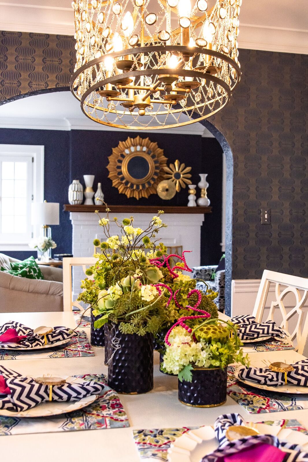
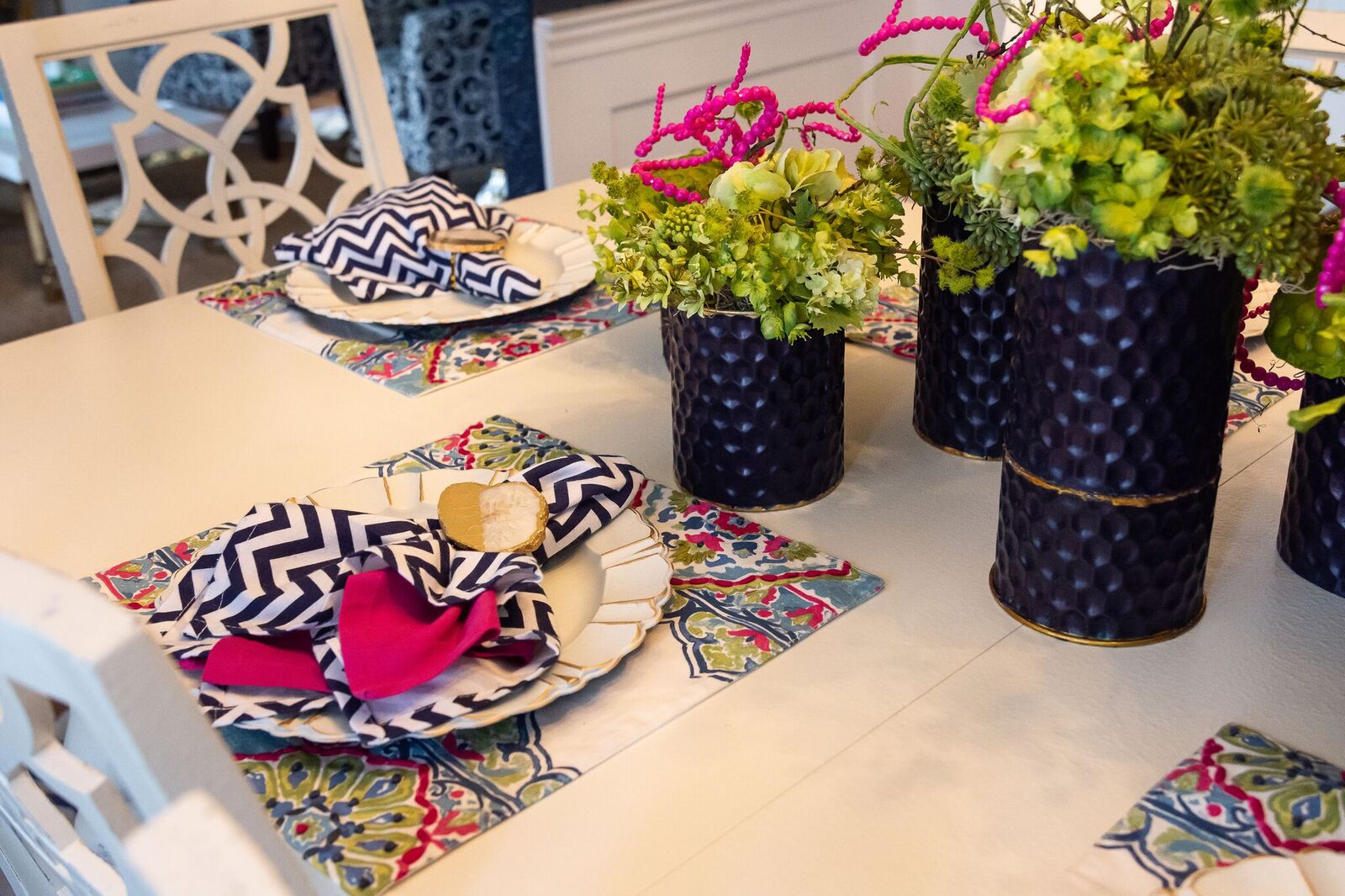
So I decided to stick with the same color scheme: Navy and bright green, with pops of pink and gold as an accent.
It’s a unique color combination (especially in these days of neutral everything for your home!), but I think it’s what really makes this room and the whole house sing.
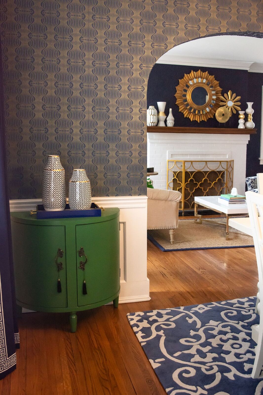
Katy fell in love with the navy and gold wallpaper shown in these pictures. I did too, so we decided to go with it. The bold pattern makes a statement with its wavy embellishments and it helped set the tone for the rest of the room.
The other “mood setter” is the rug from Surya. This blue and white pattern is exactly what I think of when I hear Kate Spade. So I knew it would be perfect.
With those two elements in place, the rest of the room came together very seamlessly.
Eye on Design of Belleville custom made the window treatments in the Greek key pattern, which compliments the pattern in the rug.
The table and chairs are from Hooker Furniture and the buffet is from Elk Lighting. I was proud of how well this furniture fit with the other elements of the room. It’s exactly what I would have created myself if I were blessed with the skills of a furniture maker!
We also added a runner on the stairs in the adjoining room to pull everything together.
 Accessorize, Accessorize, Accessorize
Now, my favorite part: the eye candy!
Accessories are my jam and I really had fun decorating this room.
This is also the area where a clear inspiration becomes important. If your vision is blurred, it is way too easy to go overboard and clutter up a design!
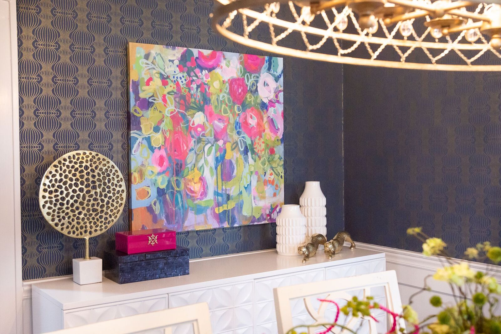
Here, I wanted to bring in some more bling with gold touches throughout. This was also a chance to layer in some additional geometric patterns (Pattern tip: As long as you use various sized patterns, the sky is the limit as far as adding them to a room).
The light fixture from Wilson Lighting ties in perfectly with the gold sculpture on the buffet. I love when design matches are made!
I also hand painted an assortment of flower containers, to pull in the navy from the curtains, rug and wallpaper. The florals themselves are from Aprils on Main.
Now, I talked in my last blog post about how the perfect place setting can really enhance your dining space. Well, I got to put those design tips into practice in this project, and I was very pleased with the results.
The placemats and linens combine all of the colors of the room and are bright little welcome signs for each person who sits at the table. They came from Home Goods — my favorite place for thrifty but chic accessories!
Lastly, we have the wall art which adds the ultimate splash of color and levity. To me, that piece really completed the room.
What is Your Design Inspiration?
As you can see, our design inspiration seeps from this room. And it’s because we had a clearly articulated vision.
Thanks again for following me on this design journey, and so many others. Remember to contact me if you want help bringing an inspired look to your home or business!