I hope everyone had a healthy and happy start to their 2022! My family enjoyed a quiet New Year’s Eve at home playing a dice game and making festive paper hats. Just the fresh start we needed!
As we head into another year filled with talk of Covid, vaccines, shortages and supply chain issues I think the one thing we can collectively agree on is that we need some good vibes in our lives.
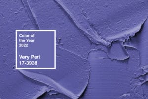
Enter the 2022 Pantone Color of the Year! Very Peri 17-3938 is a super chill shade of periwinkle.
Blue hues are known to be calming and this warm blue with tone certainly fits the bill. Aside from loving this shade, I love the meaning behind it. The folks over at Pantone always put so much thought and vision into the colors they choose, I look forward to seeing their choices every year.
“As we move into a world of unprecedented change, the selection of Pantone 17-3938 Very Peri brings a novel perspective and vision of the trusted and beloved blue color family,” states Leatrice Eisman, executive director of the Pantone Color Institute, “encompassing the qualities of the blues, yet at the same time with its violet red undertone, Pantone 17-3938 Very Peri displays a spritely, joyous attitude and dynamic presence that encourages courageous creativity and imaginative expressions.”
That last bit really speaks to me. I would so love a year filled with a joyous attitude, dynamic presence, courageous creativity and imaginative expressions. Yes, please! Sign me up! If Very Peri can help me achieve this then somebody hand me a paintbrush!
very peri pantone color of the year 2022
New Year, New Color, New Hope
Seriously though, these words are so inspiring and the color is truly stunning. I applaud Pantone for somehow capturing, through words and color, just what we are all feeling.
If you remember, last year’s choices had an equally impactful meaning. Ultimate Gray and Illuminating, a bright yellow, represented strength and hope. Those were definitely the attributes we needed coming out of 2020.
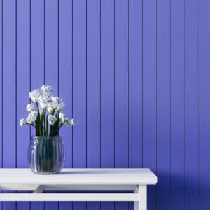
This year, as we try to settle into a new way of life, we are greeted with a soothing shade of periwinkle.
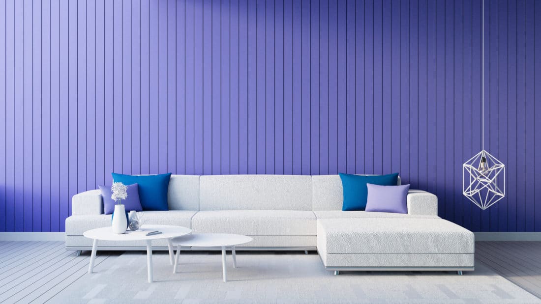
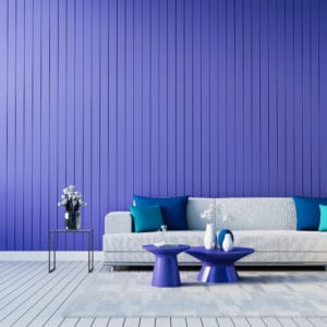
This color is so versatile, I can envision it being used as a wall color or accent color in a variety of spaces. Bringing Very Peri into your home won’t require a major overhaul, it will be easy to incorporate into existing styles.
Creating a Palette for Peri
Pantone put together a few color palettes to illustrate just how well this shade pairs with a multitude of other colors. Here are my ideas for using Very Peri in your home.
Ready to add a splash of color to your neutral modern farmhouse design? Very Peri to the rescue! Look how beautiful this shade is with gray, white and browns. This is a perfect color to incorporate into a neutral palette that will spice things up without being overpowering. It certainly is The Star of the Show!
The colors shown in the Balancing Act colorway would work well in a Mid Century home. The blues, greens and oranges are muted for a more modern feel, but definitely reminiscent of a mid century color palette.
The Amusements color palette just screams playroom to me. This would be so fun in a room designed for kids and their toys!
 Pantone describes Amusements as, “A joyous and whimsical color story of irrepressible fun and spontaneity is amplified by the carefree confidence and joyful attitude of PANTONE 17-3938 Very Peri, a twinkling blue hue whose playfulness emboldens uninhibited expression and experimentation.”
If that’s not the perfect description for a kids space then I don’t know what is!
The colors shown in Wellspring will likely appeal to nature lovers. I could see this color palette being used in a home with lots of houseplants and floral decor. The green shades invoke an earthy feel while the blues, purples and gold have me picturing big blooms.
Very Peri Is Versatile
If you’re drawn to styles like grand millennial or cottage core or even a more traditional design style, I think you’ll find Very Peri works best for you when paired with greens and blues.
Blue is always a popular choice in interior design and this shade is unique. It’s a very warm toned blue that is just lovely by itself or used with complimentary shades.
I always look forward to the revealing of the color of the year. Not only does it help get the wheels turning as I make plans for the upcoming year but it’s fun to observe, as the year progresses, how much the color catches on.
Industries from home decor to fashion, textiles, artists, graphic design and more look to the Pantone Color of the Year for inspiration. This one is such a beauty, I think we’ll see it pop up more and more throughout 2022.