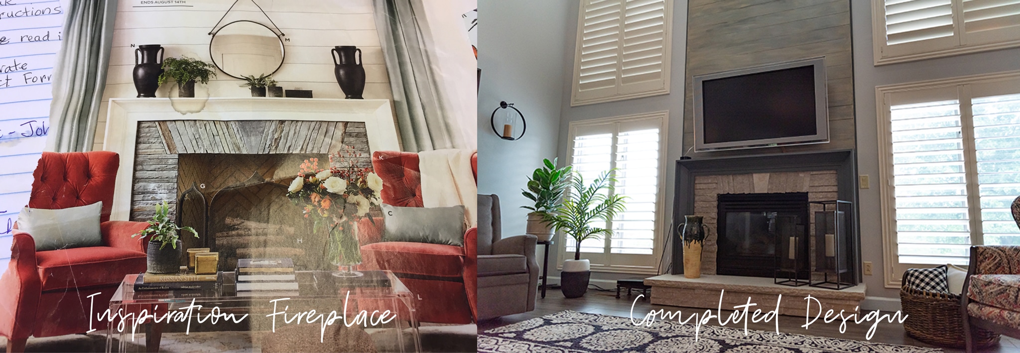
A client recently came to me with a photo of an inspiration fireplace she liked and just couldn’t get out of her head. She loved the look and wanted something similar in her house, but knew she’d need help pulling it off.
I love it when clients approach me with ideas and inspiration. Seeing their excitement as we bring their vision to life is such a joy for a designer.
In this particular home, what started as a fireplace remodel quickly grew into a main floor modern farmhouse makeover….with amazing results!
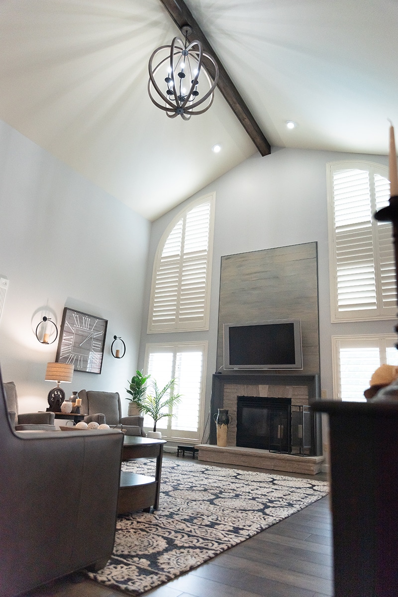 The vaulted ceilings and double windows flanking the fireplace provide the perfect backdrop to recreate the inspiration fireplace from this magazine.
First, we built the mantle and although the style is similar to the inspo photo, we opted for a dark gray color. Then we added the shiplap, also a few shades darker than the original image, and stacked stone.
I chose to use darker tones which would complement other elements of the room such as the light gray walls and white shutters.
The windows in this room provide amazing natural light and these plantation shutters from Eye on Design are a beautiful yet practical way to control just how much light is coming in.
The clients chose luxury vinyl plank (LVP) flooring in a gray tone to accommodate the three hockey-playing boys and the family dog. LVP is becoming more and more attractive to clients with active households because it is durable, waterproof, and looks great!
To keep the style of the room consistent from top to bottom, I added a wooden beam to the ceiling with a new fixture from Metro Lighting.
Next, we brought in new furniture and accents. A mixture of rustic wood, gray tones, and some metals complete the modern farmhouse look.
I love how the couch and chairs, all pieces from Hooker Furniture, work well together without being a matching set.
The mixture of fabrics and upholsteries creates visual interest in the room while the Sam Moore patterned chair adds a pop of color.
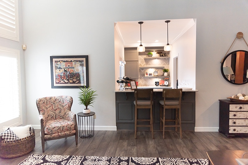
With the bar area visible from the living room, it only made sense to extend the design to this space.
We added upper cabinets for storage, pendant lighting, a few floating shelves, and this gorgeous tile, all in shades of gray. Patterned tile such as this herringbone really makes a big impact in a small space.
We incorporated hints of red accents to tie together the red from the living room. These small details are my favorite ways to sneak in color!
In the kitchen, also adjacent to the living room, we made just a few changes to update the space and give it the modern farmhouse treatment.
The cabinets, originally beige, were painted a gorgeous blue-gray by the White Pineapple out of Belleville. This facelift created the biggest change in the room.
We kept the existing flooring, countertops, and dining table but updated the fixture and centerpiece to reflect the new style.
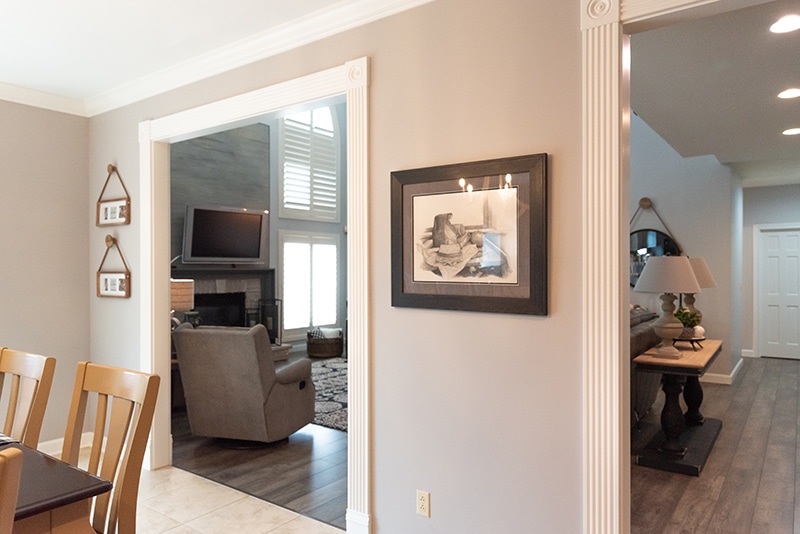 If you know me, you know I love the personal details so I couldn’t resist this beautiful charcoal drawing made by the client’s brother. I had it framed in a simple black frame to match the decor and it looks perfect hanging in the kitchen!
The last part of this reno cannot be overlooked–this adorable powder room! Wallpaper can be such a fun addition to any home and this black and white combo fits perfectly with the rest of the design.
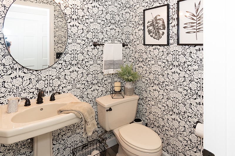
I love the intricate details in the wallpaper, the touch of greenery, and the botanical wall art. A simple mirror and light fixture compliment the bold wallpaper.
I’m so pleased with how this project turned out. The client and I worked together to make an inspiration photo cut out of a magazine and into a space for her family to gather, relax, and enjoy one another’s company. That’s what it’s all about!
