 Let’s talk about the “elephant in the room.” In design terms, of course.
I’m referring to that something that goes unmentioned, but is so blatantly obvious that it is literally screaming for attention and is impossible to ignore.
In the design world — especially with remodeling projects — we often encounter these figurative elephants in our literal rooms.
Maybe it’s soffits that are too ornate or heavy for the homeowner’s current look. Or perhaps it is an obstacle within the floor plan — say, a kitchen island, which is placed in such a way that it disrupts the flow of the room.
In my opinion, the key to a good redesign is identifying and naming that elephant in the room, and then correctly deciding what to do with it.
Do you scrap it entirely in favor of something new? Or do you find ways to incorporate it more smoothly into your design? Or do you go bold, and make this unavoidable aspect a centerpiece of your design, but in such a way that it now becomes an asset to the space?
I’ve encountered this question more times than I can count, and I can honestly say that there is no single, correct answer.
It all depends upon the specifics of the project and the cost that the homeowner has in mind.
But, again, the important thing is to identify that elephant in the room and consider it for inspiration and a challenge. Do not, I repeat, DO NOT, try to ignore it! I promise you, that elephant will not go away on its own!
Now, I wanted to share a project with you that really speaks to this concept. It’s also just a neat redesign as a whole, so I’m eager to get more eyes on it. I was pretty pleased with the finished product and I think the homeowners were as well!
The Elephant in This Room
The couple, who live in Chesterfield, were looking for some overall updates to their home and also some more seating to accommodate their family of six.
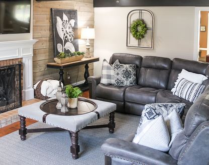 Of course, with a family of six you inevitably have some busy days between school and sports and pets and homework and you name it. So they were also looking for a family-friendly design that could stand up well to all of the activity that would be happening inside.
Logistically, we knew the project would have to be done in phases, so we first put together a plan for the living room, foyer/stairwell, and family room on the first floor.
Now, as I’ve mentioned, we very quickly had to address an elephant in the room.
As you can see, some very heavy, dark wood beams stretch across the ceiling in the family room.
They were the first thing my eyes gravitated to when I stepped inside the room. There was no ignoring those beams!
To be clear, they weren’t necessarily a negative, but they were definitely something that needed to be addressed. With the way the room was originally designed, the beams simply overpowered the space.
Given my clients’ wants and needs, we decided this would be an instance where we would embrace the elephant in the room. And, looking back, I’m so glad we did.
Keeping the beams, and building the design around them, brought some unique character to the space and made it feel warm and cozy, as a family room should be.
So let’s talk about some other elements of the design that contributed to that feel.
Shiplap Makes the Room
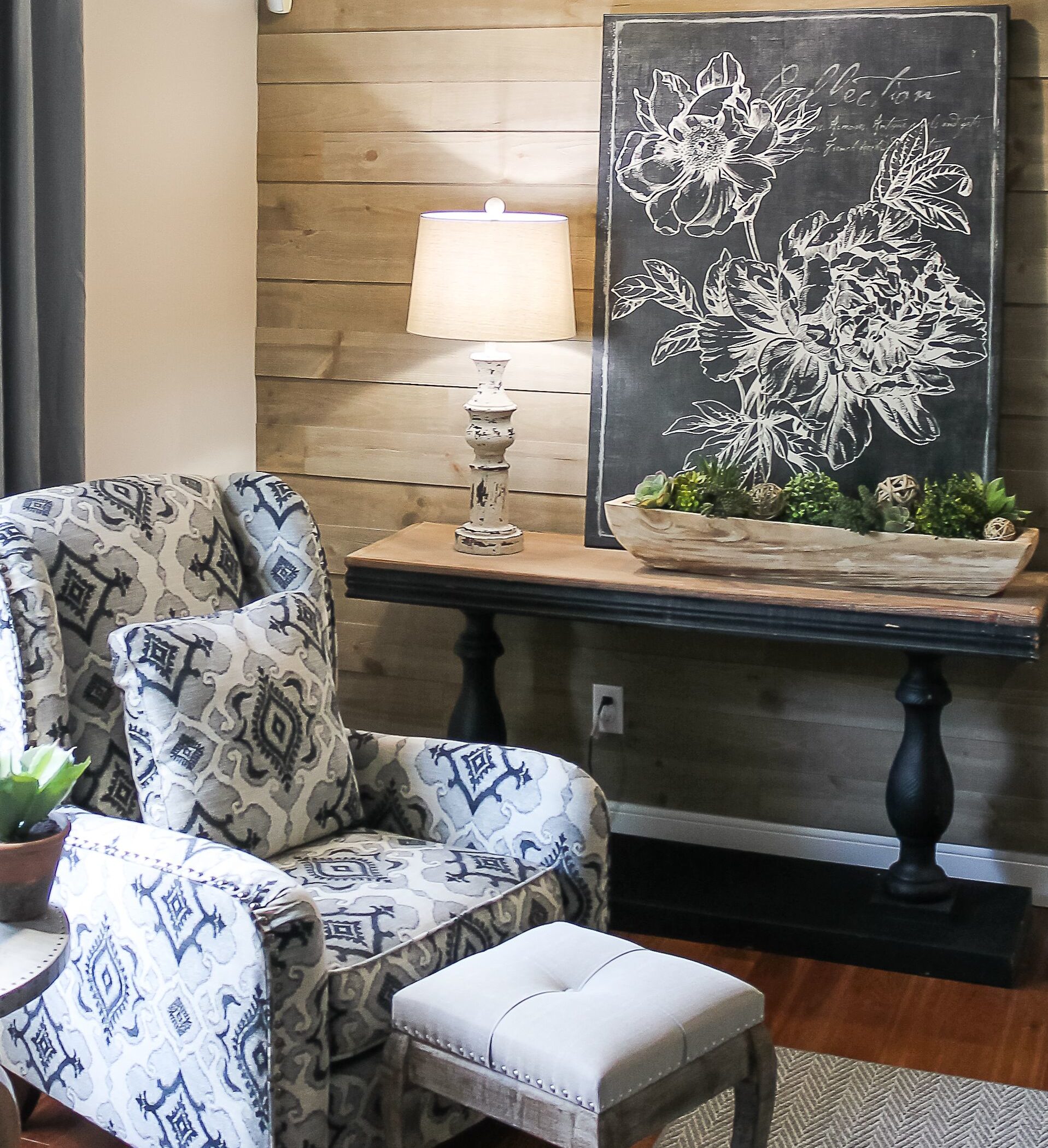
I think a game changer for this room was the textured shiplap that we added to the walls. It was like a giant hug for those dark wood ceiling beams. The minute the paneling went up, the atmosphere of the room shifted to a more cozy and cohesive feel.
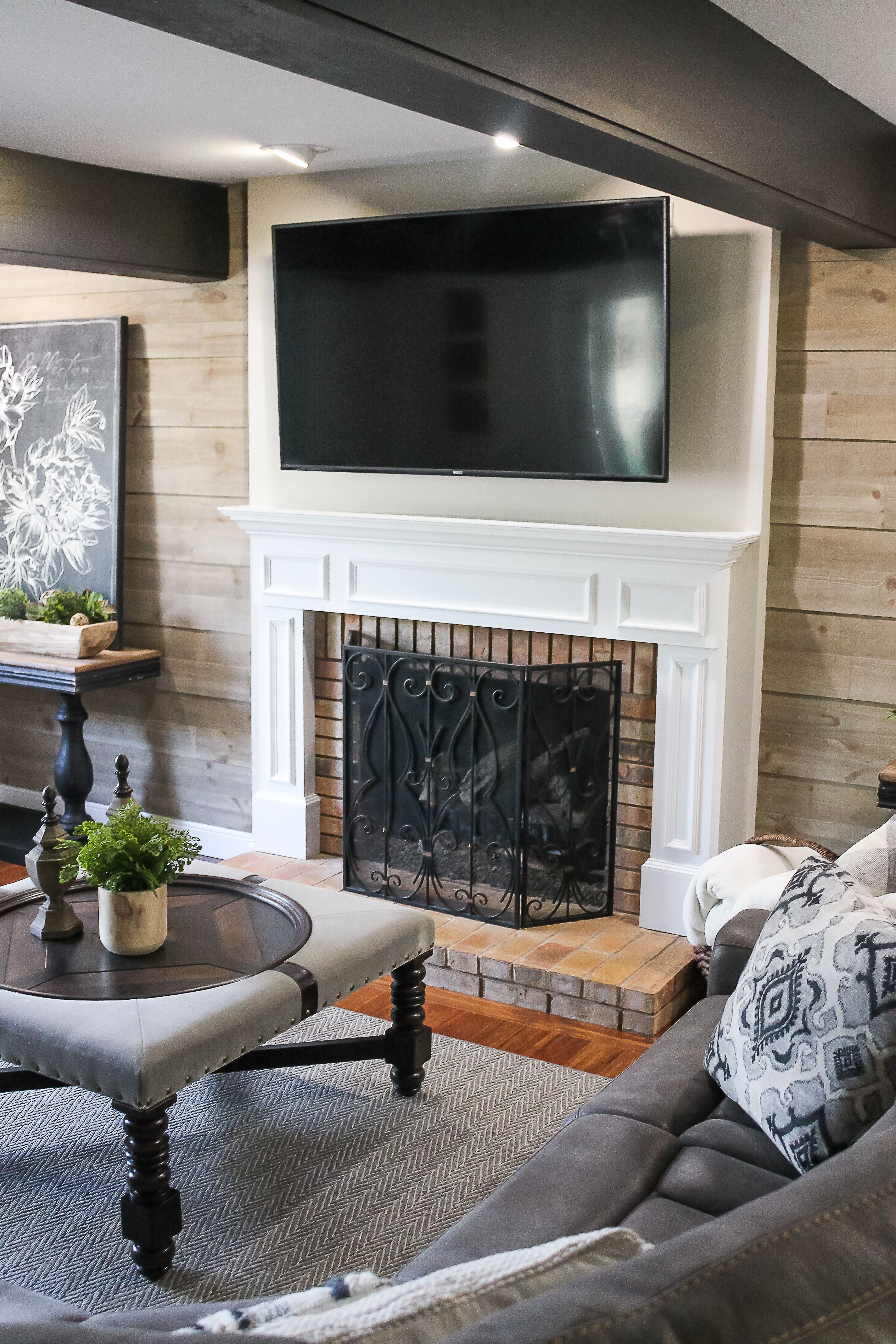 The beams no longer stood out as an outlier — they felt like they belonged. Not only that, but they now were, in fact, integral to the design.
We also decided to move the television above the fireplace, and centered the floor plan around that feature. This freed up the footprint of the room and worked to de-clutter the space (something all rooms can use!).
In a further effort to polish up the look, we removed the wet bar. For design purposes, it always looks better when you can keep all of those bottles out of site.
I went with a more masculine collection of furniture, figuring it would contribute to the comfy atmosphere of the room. The sectional, ottoman, chairs and side table are all from Carol House.
My personal favorite is the ottoman, which wonderfully ties together the ceiling beams and the shiplap. The two console tables also serve this purpose well.
I found the accessories at an array of stores — Wayfair, Kirklands, April’s on Main, Home Goods, etc. — once again proving that you don’t have to spend a fortune for a quality look.
The pictures and plants contribute to the French country feel that oozes from the room. Yummy, right?!?
And the gray area rug and drapes add warmth. The paint color I chose (Sherwin Williams’ Accessible Beige, SW7036) blends these fabrics perfectly.
Big Look for Little Money
Now, as I mentioned earlier, we had decided to move piecemeal through the house toward a larger redesign.
The next two rooms that we focused on at this phase were the living room and foyer. With both, I was very proud of how we accomplished a major facelift without too great an expense.
In the foyer, we added molding below the chair rail and painted it all the trim color to make it look like wainscotting. This is a great little trick for adding sophistication and charm without too much effort or extra cost.
I decided we should keep the hall piece — love the character it adds! — and I picked out some new accessories to freshen things up and better coordinate with the adjoining rooms.
In the living room/office, we again kept the changes to a minimum. But through careful consideration of which elements we would change, we really shifted the look.
I found an area rug from Surya that pulls in some of the colors from the family room, chose wall art that adds some yellow tones for contrast, and scattered some accessories around the room to help flesh out the redesign.
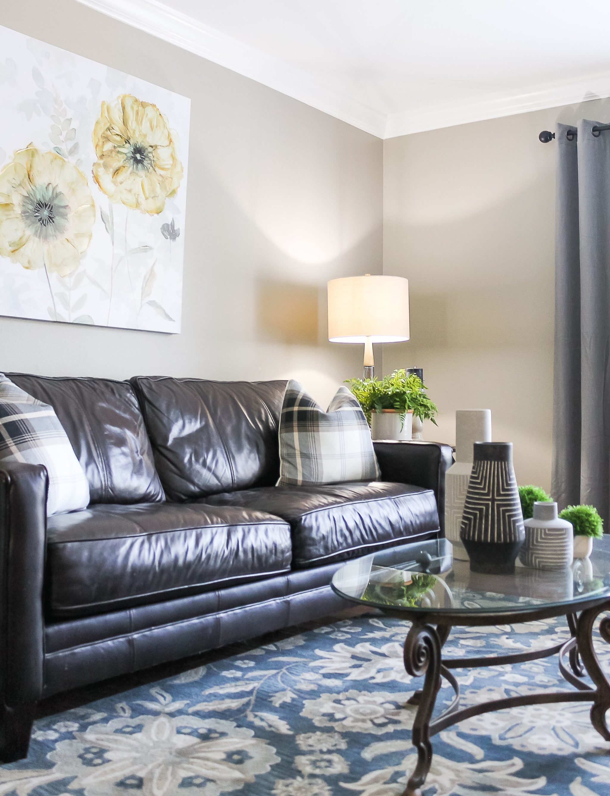 For the walls, we went with another warm gray from Sherwin Williams (Intellectual Gray, SW7045).
Next Up
All in all, each room flows nicely from the next and we were able to make this update while keeping within a reasonable budget. And by embracing our elephant in the room, we were able to keep costs even lower!
We have a number of great projects coming up for this home. The powder, dining room and kitchen — I’m getting excited just thinking about it! So stay tuned and I promise to share our progress as we go along.
And as always, if you are considering changes to your home — no matter how big or small! — I can help. Contact me at your convenience and we can start brainstorming. I’m eager to hear from you!
