 For my third and final post in the Koller home series, I wanted to talk about something magical that happens when a designer is able to establish a long-term relationship with a client.
It stops feeling like work.
Because when you have the pleasure of designing for a family through the years, you really get to know them — and you find that design ideas grow organically from one room to the next, even if several years have passed between projects.
My design relationship with the Kollers has held strong for 10 years and counting. And guess what? The work keeps getting easier and the results keep getting better.
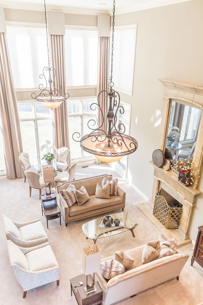
The perfect illustration of this is the family’s Great Room.
This is a room that has turned into the crown jewel of the home — and it was inspired by work I had done for the family three years earlier.
Remember the daughter’s bedroom that Mrs. Koller just fell in love with? The one that she described as having a luxurious, hotel-like feel?
That bedroom was such a success that we just HAD to pursue a similar feel elsewhere in the home.
Now, Mrs. Koller’s decision to redesign the Great Room came somewhat on a whim. When we were working on the hearth room and kitchen, she asked me to keep in mind the adjoining room, which could use “a few updates.”
“A Few Updates”
She and I laugh when we remember this conversation, because “a few updates” very quickly turned into a major overhaul. But we couldn’t help ourselves! This room just kept getting better and better.
 What Mrs. Koller liked best about her daughter’s room was its calming feel. So we decided to aim for a similar atmosphere in the Great Room, with an added elegance given that this space would be used frequently for entertaining.
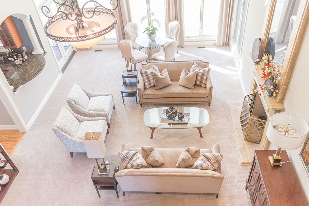
Given the use, the furniture layout was very important. The family wanted the room to be as functional as possible.
To ensure this, I took extra care in the early stages of planning and did something that I would recommend to anyone trying to purchase furniture and/or figure out a layout: we taped it out.
Using painter’s tape to draw the footprint of each piece of furniture on the floor, we were able to put together a visual and then play with the space. We could then better decide what type of furniture we wanted to add and where, having a full plan in place before one single thing was purchased.
I decided to keep the room very monochromatic, using texture and polish to add visual interest and a hint of glamour.
Choosing the Furniture
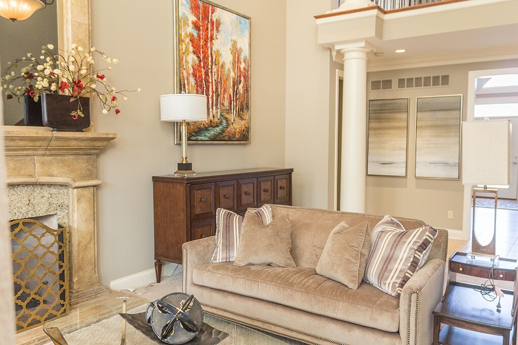
We ended up with two 72-inch wide loveseats from Taylor King, which are visually grounded by a similarly-toned carpet. Two side chairs in a damask tone-on-tone fabric from Highland House Furniture add elegance.
 A minimalist, sleek coffee table from Crate and Barrel unites the space. And the bookshelf and buffet, from Stanley Furniture, act as hosts for various accent pieces that add that polish I spoke of earlier.
Most of the accessories are from Aprils on Main in St. Charles and Metro Lighting.
Initially, the two end tables were a big question mark. About four decades old, and recovered from Mr. Koller’s family lake house, they were a little rough around the edges. But once again, Quality Furniture Restoration of St. Louis was able to work its magic. Once refinished, these became my favorite pieces in the room.
Behind the main sitting area is a game table, with a glass top and a base that is a reproduction of a rustic cog from a mill. The chairs, from Bernhardt, are in a cheetah pattern that really pops.
I was thrilled to tap my partnership with Eye on Design of Belleville for the custom window treatments in this room (read more about the partnership here!).
I went with a dramatic, floor to ceiling design in the same muted tones that are seen throughout the room. Eye on Design then created and installed the curtains, perfectly executing my vision.
 The Artwork Story
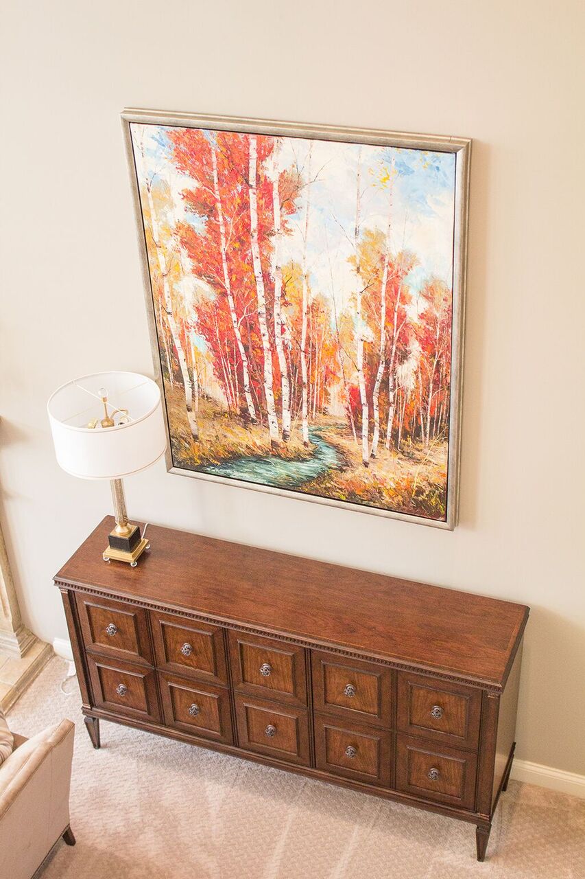
The artwork over the buffet has an interesting story — it almost never came to be! The couple was vacationing in Colorado when they found the oil painting. It was love at first sight, but apparently, they weren’t the only ones smitten. When they returned home they learned the painting had been sold.
Fortunately, the artist was willing to reproduce another one for the Kollers. This ended up being quite the blessing because we were able to pick out the dimensions and suggest more vibrant colors. And as you can see, this piece of artwork absolutely completes the room!
The Koller home has been endless design fun for me and I think now you can see why. As the family has grown and changed, so has their home, with my help. And I can’t think of anything more rewarding.
This is the third and final post in a series on the Koller home, and I apologize for the months that have passed since the last post! While we have long been planning to redesign our website, we didn’t expect for it to happen quite so suddenly! Thank you for bearing with us!
Jill
