 One of the more rewarding aspects of my job is when I can connect with a family and watch them grow through the years, helping them as their design needs change over time.
When I am invited back to someone’s home it is not only an affirmation of the work I did previously for them, but also a way to continue the design journey. And overall, I think it allows for a more cohesive look for their home.
So I thought it would be fun to spend a few blog posts walking you through one such client relationship.
I have been working with the Koller family for more than 10 years. As is often the case, we started with just one project — but that remodel spawned ideas for another, and when all was said and done, we had touched just about every major room in their home.
 In my next few posts, you’ll see how each space we designed has a very distinct feel. But as a whole, the house flows quite nicely from one room to the next.
Bye bye teen bedrooms
I first reconnected with the Koller family in 2014, when they were looking to update their daughters’ bedrooms.
Even though the girls were in college, it was time to give these “teen” rooms a much needed makeover.
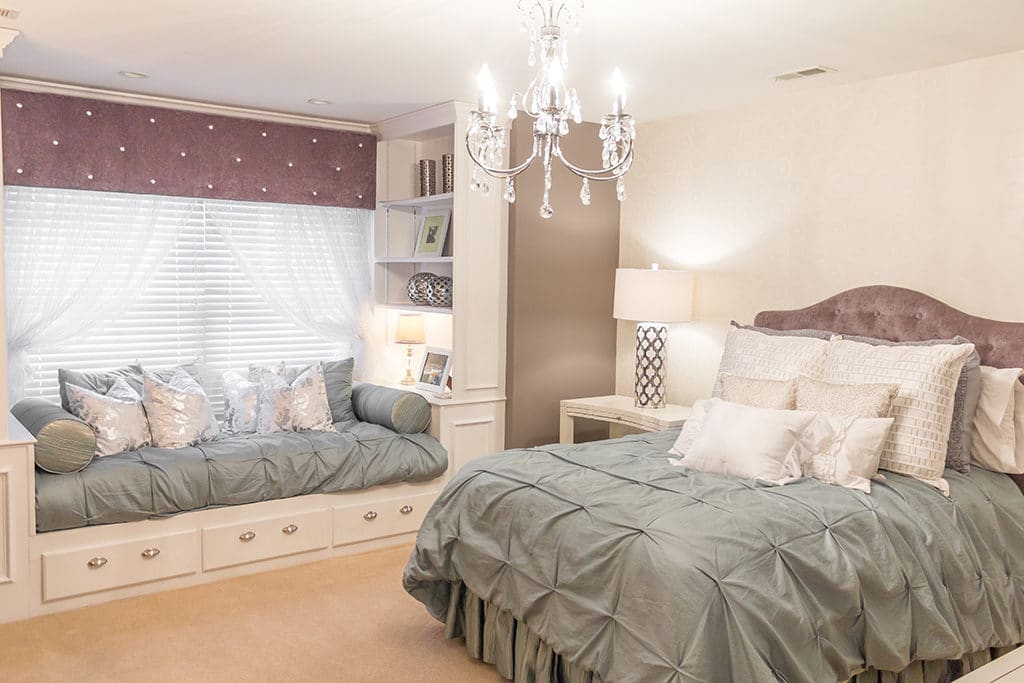
One daughter dreamed of a polished and sophisticated room that still had a little sparkle. I knew I could give her that shimmery sheen she craved, but I also wanted to be careful not to go overboard. When it comes to glitz, a little can go a long way.
I started with a muted seafoam bedding on the bed and then designed the window seat daybed to match. I picked this calming color to give the eye a break, because I knew we’d be incorporating a fair amount of bling elsewhere in the room.
The grey tufted headboard served the same purpose.
I used the bed wall as our accent wall, covering it with an off-white wallpaper with a subtle geometric pattern in a glossy silver.
Notice how the throw pillows on the bed draw out this pattern. I went with a mix of neutral throw pillows — ones I thought could add a bit of texture without being too busy when paired with the wallpaper.
The window treatments pick up the tufting from the headboard, and here again, I was able to add a little sparkle by using rhinestones for the button tufts.
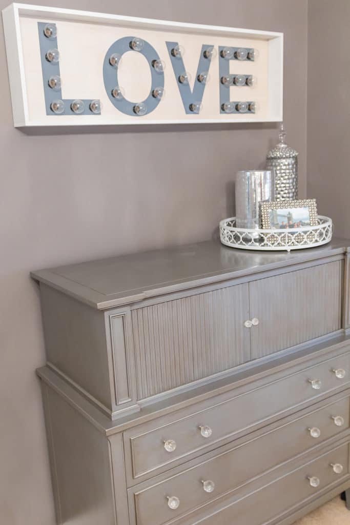
T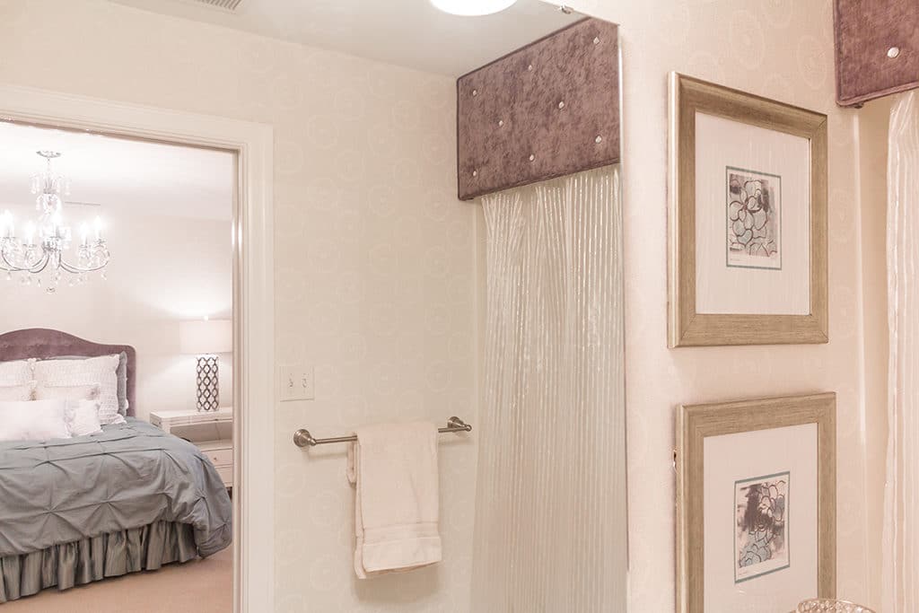 he chandelier adds to that romantic feel, as does the “LOVE” sign with marquee letter lights.
The Kollers and I were struggling to find the perfect furniture for this room. Then we finally realized it had been staring at us the entire time.
The furniture that was meant to be was already in the home — it was the first set of furniture this couple had bought together and it had a really cool, retro appeal.
Quality Furniture Restoration of St. Louis helped us refinish the dresser and paint it silver. This created a glamorous feel that in my opinion really completed the room.
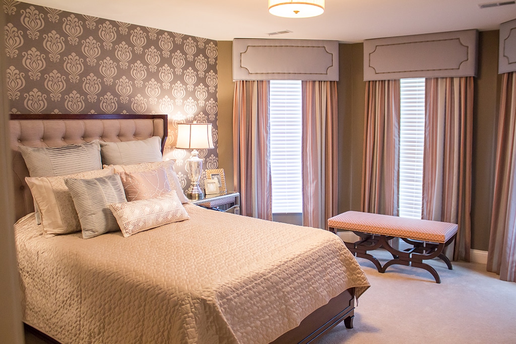
The second bedroom ended up being the Koller’s favorite room and it has helped inspire other design work in the home.
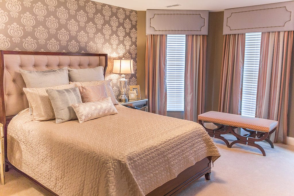 Mrs. Koller has told me that going into the room feels like walking into a luxurious hotel. I’ll tell you — as a designer, there’s no greater compliment!
As with the first bedroom, I used the bed wall as our accent wall and went with a tone on tone wallpaper, which helped set our color theme for the room.
The quilted satin bedding, from Macy’s, is paired with silky throw pillows and a tufted headboard, which collectively give off a soft, rosy hue.
Coordinating fabrics for the window treatments further pull together the room and add to the luxurious feel.
The bed and nightstands are from Hooker Furniture and work well with the transitional look we were going for.
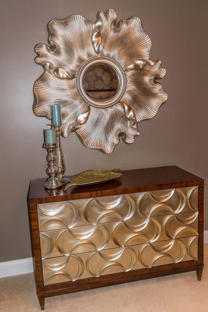 Which brings me to my favorite piece — that gorgeous dresser from Caracole! Caracole has some really unique pieces and this dresser does not disappoint.
The second you step inside the room your eye is drawn to it. An equally stunning mirror above it helped to double down on the wow factor.
As I mentioned, this room would later provide inspiration for my work in other areas of the home. So stay tuned as I talk about those projects in coming weeks!

